What are Filter Layouts?
Filter layouts are the visual look of your filter options and filter trees. They are how conveniently you display filter options for visitors to perform product filtering when browsing products on your Shopify store.
Filter layouts are visible when you select a filter option from the menu in your Shopify store. There are often two main filter layouts: horizontal (above search results) and vertical (in the left sidebar).
What makes Filter Layouts important to your Shopify store?
Filter layouts add a nice touch to the look and feel of your store’s aesthetics. They also give customers the opportunity to adhere to the DRY (Don’t Repeat Yourself) concept, which is one of their key advantages.
We can quickly make global modifications and adjust for each category with the same effort because all of our common elements are in the same filter layout. Another advantage is that it aids customers in directing their demands to the preferred filter layout for certain products in your store.
Examples of Filter Layouts
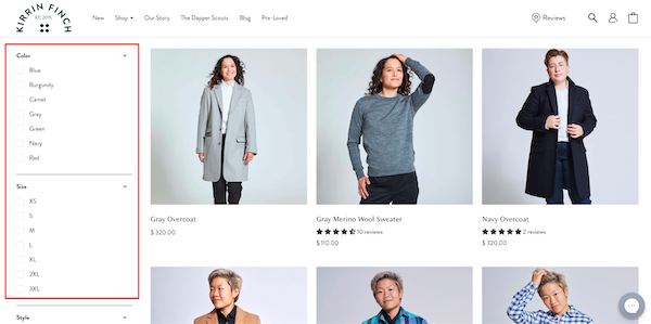
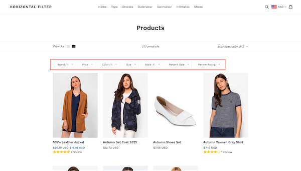
There are two different layout options for the filter layout: vertical and horizontal.
Vertical layout


Horizontal layout


Best practices for Filter Layouts
Activate the multi-select filter with the different sorting choices
Multi-select filters are essential because faceted navigation with dynamic filters is frequently used in eCommerce and it is impossible to find the ideal product with just one refinement. From their usability test sessions, Baymard discovered that 45% of customers tried to use multiple filter values for the same filter type. But just one-third of the test sites succeeded in doing this.
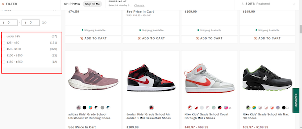


Don’t forget to have a look at the “AND/OR” logic to make the results of the after-filter useful. While different filtering values of the same option should follow a “OR” logic, distinct filter options should follow a “AND” logic.
Optimize sorting filter options in all filter layouts
The user’s product discovery and selection process can be considerably sped up with only one sorting click.
While alphabetical ordering is rarely appropriate in an e-commerce setting, there are other practical sorting choices to consider:
- Price
- Rating
- Arrival/Release Date
- Popularity
- % Sale
Additionally, you’d better display only a maximum of 5 sorting options in filter layouts in order to minimize lengthy sorting drop-downs that can mislead users.
Select the proper facets or filter options
Due to the variety of products, eCommerce sites rarely have a filter that is “one size fits all.” Retailers must be able to provide pertinent filtering options for each category and collection, especially those with a variety of products.
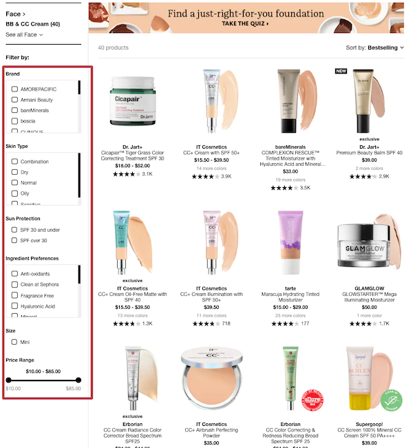


When it comes to filter layouts for online stores, product attributes should be the very first thing taken into account. A product attribute should, in general, be provided as a filter if it needs to be displayed in the product listing, such as size, color, or variant.
When creating eCommerce filters, there are other equally important things to take into account.
It will be quite beneficial to have a solid understanding of the features that customers value most in a product. For instance, a lot of online shops offer a location filter as a way for customers in a hurry to rapidly find nearby products.
Additionally, it is always useful to look at how other merchants create their filter trees. Customers won’t have to spend time getting used to a new filter layout thanks to standard design patterns that create familiarity and relevance.
Combine with a search box in your layout
Because it obscures the view of all other filter options, the lengthy list of more than 10 filtering values may degrade the user experience. Collapsible filters are necessary in order to create a tidy and clear website interface. Due to the constrained screen space, filters with a hide/show button are typically implemented in mobile versions.
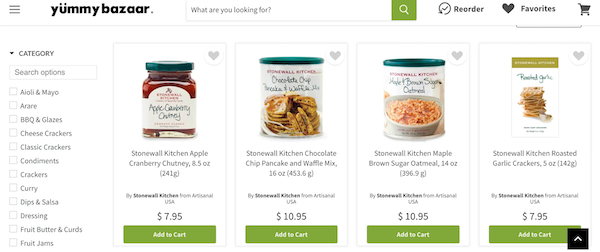


Additionally, if a facet has a lot of values, it’s a good idea to include a search box so users can easily discover the value they are looking for without having to scroll down. Just keep in mind that the values in this filter choice must be well-known for customers to know what to look for.
You should also attempt to reduce the lengthy list by adding a “Show All Values” or “View more” option. Truncated lists perform better in terms of UI/UX than inline scroll areas when used properly.
Consider the following while using truncation for product filters:
- The number of values to show before being truncated: the ideal number is 10, although it also depends on how many values there are in all.
- To avoid users mistaking the “Show All” button for a clickable filter value, the button’s style must be distinctive.
Avoid using unclear names and business jargon
When a website has filter options that are jargon-heavy and industry-specific, users frequently fail to apply the proper filters. Even worse, if they don’t know how to filter the product list to fulfill their demands, many prospective customers will leave the website.
Site owners should initially strive to replace industry-specific filters with frequently used phrases because understanding concerns are crucial.
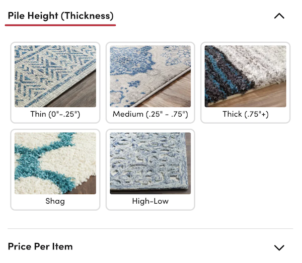
Nevertheless, there are numerous instances where we are unable to discover suitable replacements for the industrial jargon. Then, it is preferable to use a tooltip to provide further explanation or a visual display.


Give customers convenient access to the filter editing
The selected filters are typically highlighted or given a checkmark on all web pages. The problem with this method is that it doesn’t give clients a comprehensive view of all the applied criteria in a big filter tree. Before moving on to the new filter, they could neglect to uncheck the previous ones, which leads to results that are unclear following refinement. Therefore, it’s useful to let them know which filters are in use and to provide a button to turn all filters off at once.
The vertical filter tree should have information about the chosen filters at the top. Most users can rapidly check or remove the imposed filters from this location.
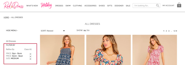


Right above the product list is another visible location to display filters that have been used. However, choosing this position may result in the product list being moved to the bottom.


