If your users cannot locate what they are looking for in a flash of an eye in a pool of thousands of inventory without filtering, 75% of them will become lost and distracted. To aid with this, Shopify provides an advanced and customizable product filter design and search bar.
It enables customers to not only identify products but to refine their searches to the level of detail they require. With over a hundred Shopify search apps at your command, selecting one is trickier than it sounds.
What is Filter Design?
In Shopify, using tags to group relevant information pieces in search and collection pages is a process known as filter design. Visitors are curious about the products and a variety of their features.
For instance, summer-appropriate clothing or footwear may be given the “Summer” tag. The visitor to the store will see a collection of summer products when Shopify filters by this tag.
Almost all relevant criteria for the buyer are covered by the large variety of search filters:
- filter by size;
- filter by color;
- filter by price range;
- filter by vendor;
- filter by product style;
- filter by the type of material, etc.
With a light and fast product search, customers may check out more quickly and you can reduce drop-offs on your online store.
What makes Filter Design important to your Shopify store?
Filters can assist customers in searching through a variety of products to find those that best meet their needs when they are correctly implemented.
As a result, you may provide various customers with a fantastic product search experience. Others might only choose things with excellent evaluations, while some would wish to discover the right size. Your users can quickly find the product page they want by narrowing their search depending on whatever preferences they may have.
Optimizing your product filters offers seamless product discovery for shops with numerous SKUs. Additionally, it aids in boosting sales, consumer interaction, and product views.
Filter Design Examples
Here are a few instances of eCommerce shops that have used product filters to enhance their business’s user experience and aesthetics in case you’re wondering how they may help your store operate better overall.
The product filtering layout of Colour Pop is organized and precise. If you wish to buy a highlighter, for instance, you can use a variety of product filters, such as product type, color, rating, and more. By each segment, you can further refine your search.
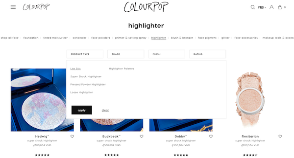


If you choose the “peaches” shade, you will see 2 highlighter options. Surprisingly, this feature is absent from over 32% of online retailers. Now consider how time-consuming and challenging shopping can be in those establishments.
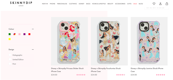
The auto-complete search experience on Skinny Dip is excellent. When looking for a product (like a phone case), SkinDip provides a list of choices right away. On the left side of your screen, there is a section for product filters as well. “Color,” “Price,” or “Brand” are the options available for filtering.


Related terms to Filter Design
Storefront filtering
The suggested way for filtering products is storefront filtering. It enables retailers to quickly build filter groups using information about current products, including availability, cost, variant possibilities, and more. These filters can be used on collections as well as search results.
You should also become familiar with the UX factors for storefront filtering. Filters are applied with AND logic, and filter values with OR. You can return items that are one color or another, or you can return items that are a particular size and color. When filters are applied, they are reflected via URL parameters in the collection or search URL.
Tag Filtering
Product tags can be used to narrow down a group of products into more manageable subsets.
Filter Design best practices
Providing a wide range of Filtering Options
A product can be described in many different ways, and there are numerous filters that can be used to separate different items. Some of the most popular filtering apps pertaining to:
- Price range
- User ratings
- Color
- Size
- Brand
- Availability
- Popularity, among items.
Having these many filters available during a product search enables users to focus their search. The more product descriptions you offer and the more filters you have available to customers, the easier it will be for them to find the precise selection of products they’re looking for.
This demonstrates that the first step is to select a Shopify product filter that gives you access to a wide range of filters.
Personalized Filters
Although the default filtering options are highly flexible, your complete product description might not be covered. For a Shopify store that sells a certain kind of goods, adding personalized filters is highly beneficial.
Additionally, you might use choices for thematic filtering based on activities associated with that product. These default filters are not the standard ones you get with most search programs.
Search for a Multi-Select Option
Your visitors can significantly narrow down search results by choosing numerous filters for the same search. However, some certain Shopify product filter apps don’t let you accomplish this.
What is left to do for your visitors? The next step is for them to go through each result filter, memorize results if they can, and choose the item they have already seen several times.
This wears you out and degrades the user experience.
Never rely on the presence of this feature in all Shopify search apps or filters. Make sure your website visitors can access it and verify that you receive this via the app you’ve chosen.
Adjust Filter Options
In this case, we’re talking about alternatives to prevent your users from employing ineffective filters. The ability to remove filters from your Shopify search app is just as crucial as the ability to add new ones.
Avoiding sending your visitors to the “no results” page is the main objective here. You eliminate filters that don’t represent the products you currently have in stock since they don’t want to view that.
However, having to do this again could be an extra effort you don’t enjoy doing.
Luckily, there are search apps for Shopify that provide dynamic filtering possibilities.
By using dynamic filtering, you can dynamically adjust your filtering choices based on the availability of products and make sure that users always see products from all queries.
Mobile Responsiveness
Mobile device users account for 72% of the overall market share for eCommerce. As a result, the bulk of your potential customers are likely to utilize mobile devices, thus you don’t want to ruin their user experience.
As a result, you want filter software that gives you options that are tailored to them. You choose a filter app with widgets for search and filtering that are optimized for mobile devices.
Real-Time Filtering
This is another feature that directly affects how your customers feel about you.
Do users of your website have to load new pages in order to view the results of filtered searches? Why don’t you simplify everything for them?
Search results from real-time filtering show up on the same page and react to each filter that is chosen. Your visitors won’t need to wait for a new page to load; instead, they can examine the results of each filter on a single page and freely switch between them.
Drop-down Filtering Menu
When it comes to UI design, simplicity is your best chance. However, giving your visitors a variety of filtering options ensures that they have the greatest possible user experience. How are these two balanced?
You want no filtering options to be shown when your search results are first presented. You don’t want to overload your visitors right away with too many filters that they might not even need.
Maintaining this straightforward interface is made easier by placing your filters within a drop-down menu. They are only called upon by users when necessary.
Filter Design fits your UI
Additionally, you want to make sure that your filtering app’s design does not clash with the layout of your store. For Shopify stores, maintaining correct SEO is aided by a strong UI design.
Separate filtering promotions
Now, your website users can access the drop-down filter menu without always opening it. Alongside your Shopify search box, you may advertise some of the most popular filters.
We refer to this as “promotion” when we leave some easily accessible filters out of the drop-down menu. When users seek more specific search results, further filters are then shown. You need a Shopify product filter app to make this possible.
Integrated Search And Filter features
Not every search app comes with built-in filtering features, and not every Shopify product filter app has a search bar.
You and your store won’t benefit as much from integrating two separate apps for these various capabilities. You run the danger of making your website load more slowly, and in most circumstances, you probably spend more money than is necessary.
Picking a single app that provides you with the necessary extensive search and filtering tools is the solution.
Ending thoughts
It’s crucial to simplify the product filter design process when you have hundreds of products on your Shopify site. Your clients will be able to exclude things they don’t want to see and filter out products they do.
Give customers the ability to easily locate what they’re looking for by utilizing the 14-day trial Shopify product filter and search by Boost. They are more likely to spend more money the quicker they can find the items they require. And that translates into more sales, more earnings, and content customers.


